In This Article
Understanding the KPI Chart Display
Chart Options and Customization
Tips for Effective Chart Usage
Overview
The KPI Chart is a visual representation of your KPI performance over time. It displays captured KPI values, allowing you to analyze trends, compare actuals against targets and baselines, and monitor performance. This article explains how to access the KPI Chart, understand what is displayed, and interpret the visualization.
Accessing the KPI Chart
To view the KPI Chart: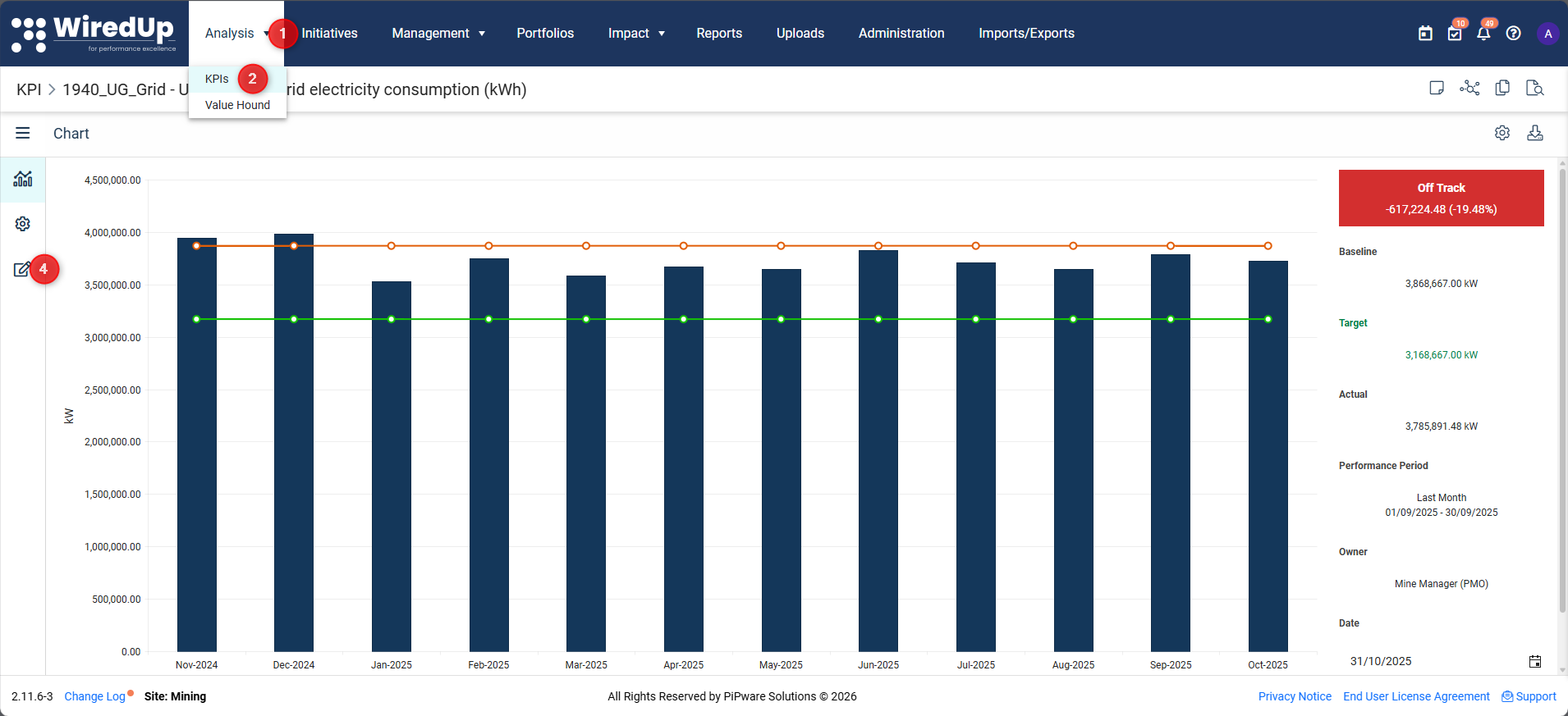
- Navigate to Analysis in the main menu
- Select KPIs from the dropdown options
- Click on the Name of the KPI you want to view
- The KPI Chart will display by default, or click the three-bar menu and select Chart
Understanding the KPI Chart Display
The KPI Chart visualizes the data captured in the KPI Values section. The chart displays:
Chart Elements
Bars/Data Points:
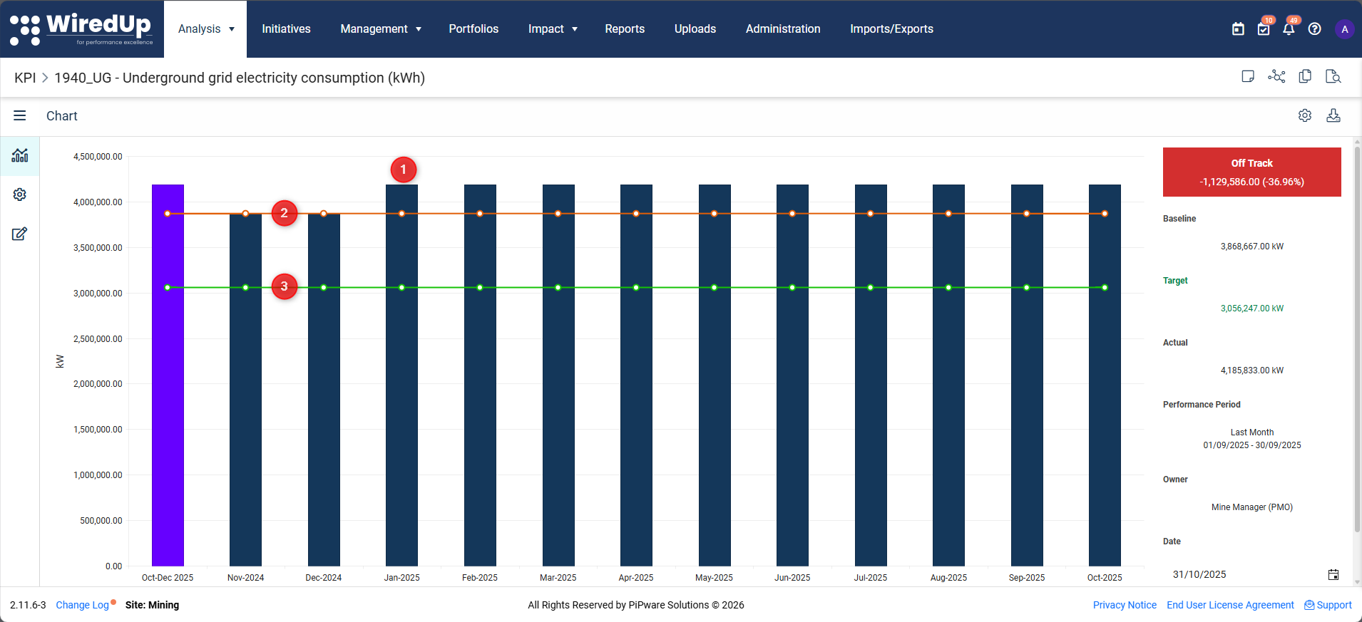
- Actual values: The actual performance data captured for each time period
- Target line: The target performance level you aim to achieve
- Baseline line: The starting point or reference level for comparison
Time Range:
- The date range and number of bars displayed correspond to the time period settings in Chart Options
- The time periods shown are based on the KPI's Target Frequency (Daily, Weekly, Monthly, Quarterly, Annually)
Unit of Measure:
- Chart values are displayed using the Unit of Measure (UoM) configured for the KPI
- The displayed value is calculated as: Chart value = Captured value × UoM display factor
Example: If your KPI tracks costs in thousands of dollars, the UoM display factor might convert 1000 to 1 for easier reading on the chart.
Chart Sidebar - Summary Area and Performance Status
The chart sidebar (displayed on the right side of the chart) shows key performance metrics and status:
Status Indicators:
The top of the sidebar displays a status indicator showing the current performance state: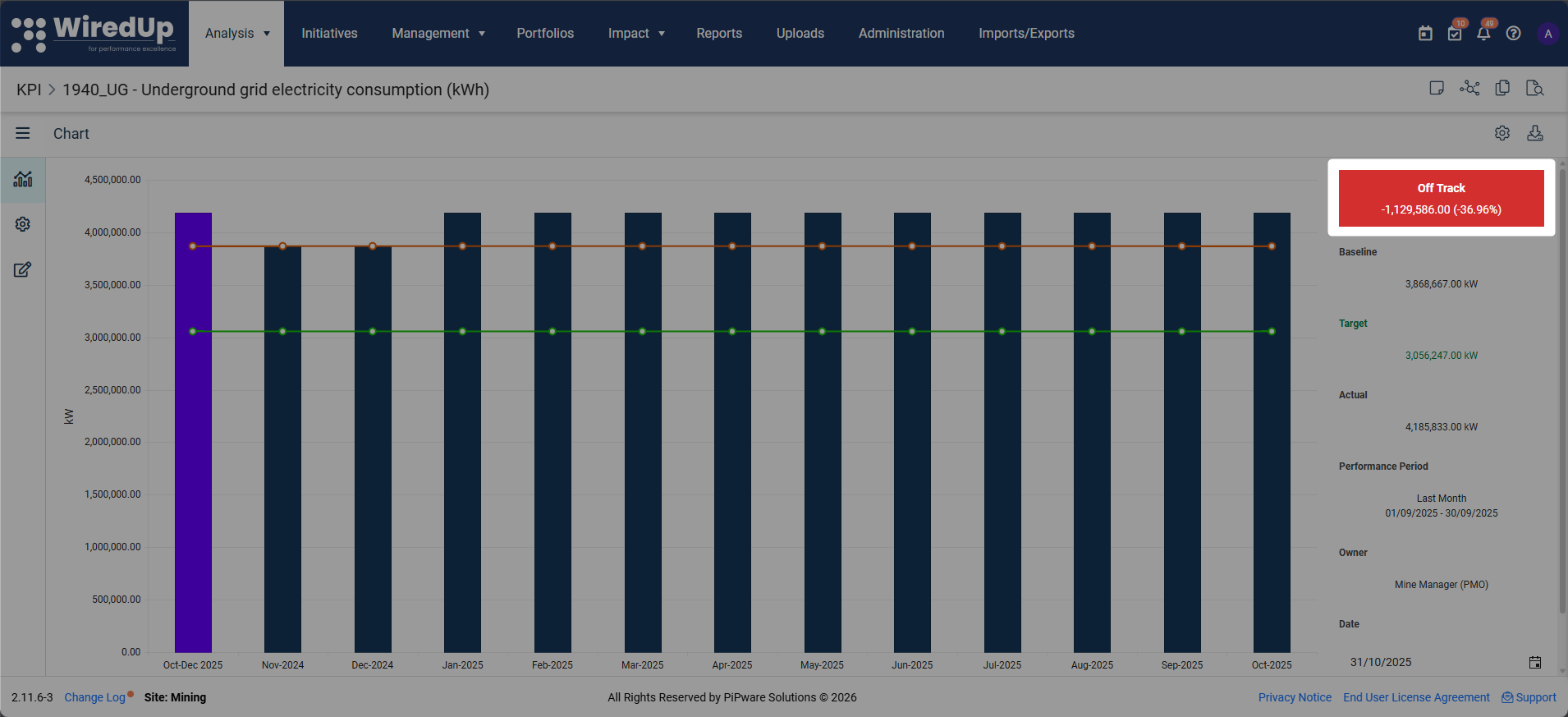
- No Data: The KPI has not been updated for the current performance period
- On Track: Performance is meeting or exceeding targets (typically displayed in green)
- Off Track: Performance is below acceptable levels and not meeting targets (typically displayed in red)
- At Risk: Performance is approaching thresholds and may fall off track (typically displayed in amber)
The status is determined by comparing actual values against targets and any configured performance ranges.
Summary Metrics: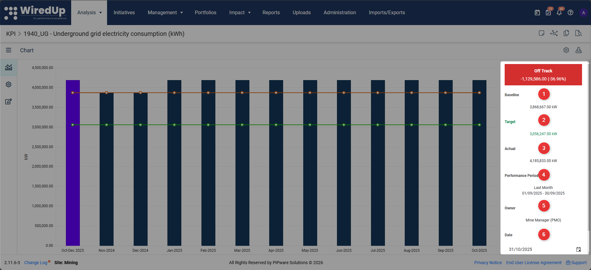
- Baseline: The baseline value for the selected period
- Target: The target value for the selected period
- Actual: The actual value achieved for the selected period
- Performance Period: The date range used to calculate the summary values (e.g., "Last Month: 01-02-2026 - 28-02-2026")
- Owner: The person responsible for the KPI
- Date: The reporting date
Important: The summary values are calculated based on the Performance Period setting, which can be adjusted in Chart Options. This means the summary might show "Last Month" data even if you're viewing a longer time range on the chart.
Chart Options and Customization
You can customize how the KPI Chart displays data by clicking the Options icon (config icon) at the top-right of the chart. The following options are available:
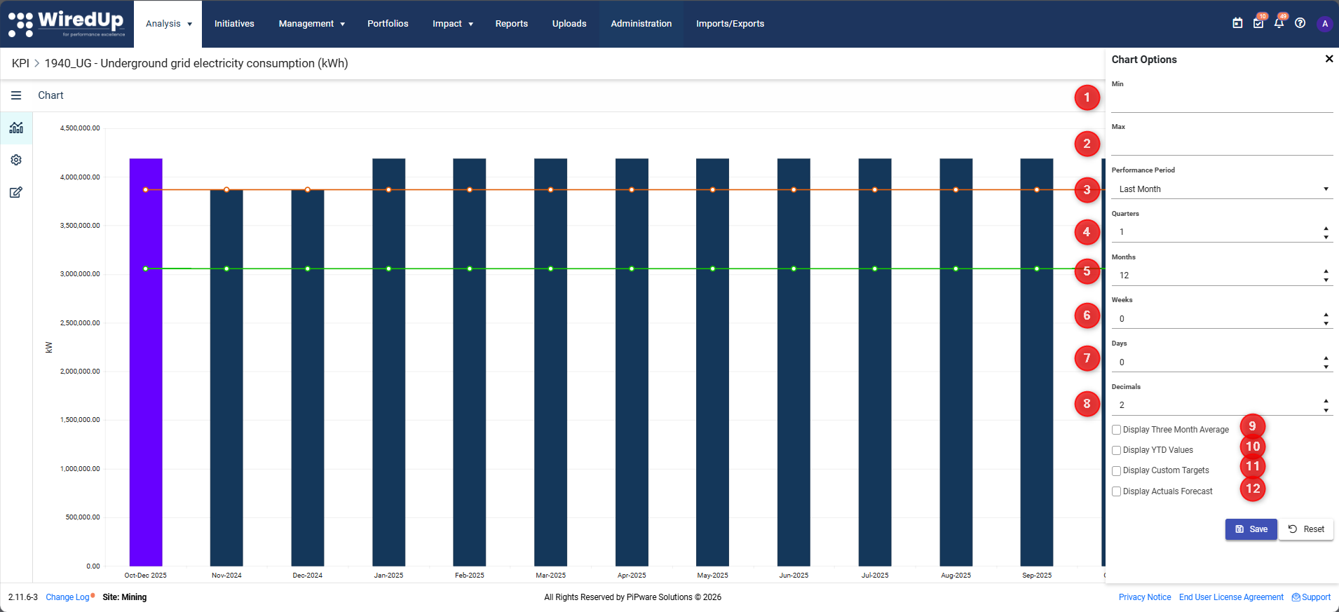
- Min: Set the minimum value for the chart Y-axis
- Max: Set the maximum value for the chart Y-axis
- Performance Period: Select which time period to display in the summary (e.g., Last Month, Last Quarter, Custom)
- Quarters: Specify the number of quarters to display on the chart
- Months: Specify the number of months to display on the chart
- Weeks: Specify the number of weeks to display on the chart
- Days: Specify the number of days to display on the chart
- Decimals: Control the number of decimal places shown on the chart
- Display Three Month Average: Check this box to show a rolling 3-month average line
- Display YTD Values: Check this box to show Year-to-Date values
- Display Custom Targets: Check this box to show custom target values
- Display Actuals Forecast: Check this box to show forecasted actual values
After making changes, click Save to apply your settings, or click Reset to restore default values.
Tip: For detailed information about all chart options, refer to the KPI Chart Options article.
Interpreting KPI Performance
When analyzing the KPI Chart, consider the following:
Trend Analysis
Look at the pattern of actual values over time:
- Upward trend: Values are increasing over time
- Downward trend: Values are decreasing over time
- Flat trend: Values remain relatively stable
- Volatile trend: Values fluctuate significantly between periods
Remember: Whether an upward or downward trend is "good" depends on your KPI's Expected Trend (determined by the Baseline-Target relationship).
Variance Analysis
Compare actual values to targets:
- Positive variance: Actual is better than target (interpretation depends on Expected Trend)
- Negative variance: Actual is worse than target (interpretation depends on Expected Trend)
- Variance percentage: Shows the magnitude of the difference
Data Freshness
Check if the KPI has current data:
- If the "No Data" status indicator appears in the sidebar, the KPI has not been updated for the current performance period
- Check the Up to Date status on the KPI List to identify KPIs that need updating
- Refer to the Values section to add or update data
Note: In order for the status to be calculated, an Actual value for the performance period is required; no actual value will display in grey with N/A variance.

Green Status
An actual value was captured and performance is better than the target, resulting in a positive variance calculated. For example, an upward tending KPI with a target of 90 and a captured actual of 100 will result in a variance of 10.

Red Status
An actual value was captured and performance is below target, resulting in a negative variance calculated. For example, an upward trending KPI with a target of 100 and a captured actual of 90 will result in a variance of -10.
Using the Chart for Analysis
Identifying Performance Issues
- Look for periods where actual values fall significantly below (or above) target
- Check if the issue is a one-time occurrence or part of a trend
- Use the Notes and Attachment icon to document observations
- Review related KPIs to understand contributing factors
Communicating Performance
The KPI Chart is useful on:
- Dashboards: Add KPI Charts as widgets to display trends and progress toward targets
- Initiative Performance: Monitor KPI performance linked to specific initiatives
- Downloads: Download KPI charts for documentation
Tips for Effective Chart Usage
- Adjust the time range: Use Chart Options to focus on relevant periods (e.g., last 12 months, current quarter)
- Check performance ranges: If configured, use the colored zones to quickly assess whether performance is acceptable
- Monitor the sidebar: Regularly check the summary area for performance status and the "No Data" indicator
- Document insights: Use the Notes feature to capture observations and action items directly on the KPI
Next Steps
Now that you understand how to use the KPI Chart, you may want to explore:
- KPI Chart Options: Learn about advanced chart configuration settings
- KPI Values: Discover how to add values to KPIs