In This Article
- 1. Min
- 2. Max
- 3. Performance Period
- 4. Quarters
- 5. Months
- 6. Weeks
- 7. Days
- 8. Decimals
- 9. Display Three Month Average
- 10. Display YTD Values
- 11. Display Custom Targets
- 12. Display Actuals Forecast
Tips for Using Chart Options Effectively
Overview
The KPI Chart Options panel allows you to customize how your KPI data is displayed on the chart. You can control the chart scale, time periods, decimal precision, and enable additional data series to enhance your analysis. This article explains how to access the Chart Options panel and configure each available setting.
Accessing KPI Chart Options
To open the KPI Chart Options panel:
- Navigate to Analysis in the main menu
- Select KPIs from the dropdown options
- Click on the Name of the KPI you want to view
- The KPI Chart will display by default, or click the three-bar menu and select Chart
- Click the Options (configuration) icon in the top-right of the chart screen
- The Chart Options panel will open
Understanding Chart Options
The Chart Options panel contains settings that control how your KPI chart displays data. Each setting affects different aspects of the visualization.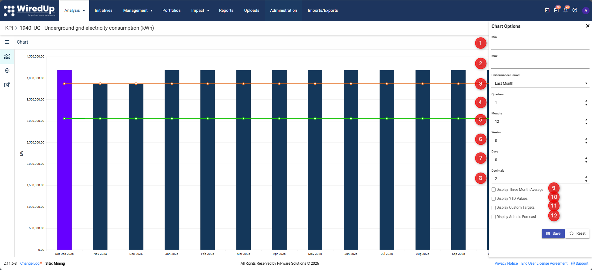
1. Min
Set the minimum value for the chart Y-axis. This controls the lowest value displayed on the chart scale.
When to use: Set a minimum value when you want to focus on a specific range of data or maintain consistent scaling across multiple charts.
Example: If your KPI values range from 80 to 100, setting Min to 75 ensures the chart doesn't start at 0, making variations more visible.
2. Max
Set the maximum value for the chart Y-axis. This controls the highest value displayed on the chart scale.
When to use: Set a maximum value to prevent outliers from compressing the rest of your data or to maintain consistent scaling across multiple charts.
Example: If your KPI typically ranges from 0 to 100 but occasionally spikes to 200, setting Max to 120 keeps the chart focused on normal performance.
Tip: Leave Min and Max blank to allow WiredUp to automatically scale the chart based on your data.3. Performance Period
Select the time period used to determine KPI performance. This setting controls which period's data is displayed in the chart summary area.
Available options include:
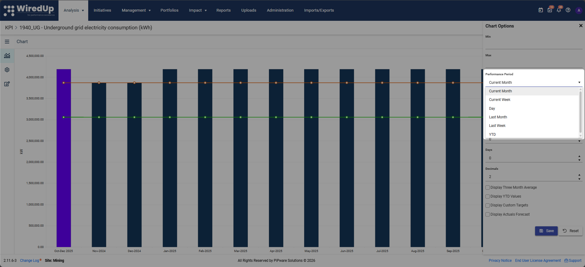
- Current Month
- Current Week
- Day
- Last Month
- Last Week
- YTD
Important: The Performance Period setting also determines the Target and Actual values shown on KPI cards and in the chart sidebar.4. Quarters
Specify the number of quarters to display on the chart.
Example: Enter "4" to display the last 4 quarters of data.
5. Months
Specify the number of months to display on the chart.
Example: Enter "12" to display the last 12 months of data.
6. Weeks
Specify the number of weeks to display on the chart.
Example: Enter "8" to display the last 8 weeks of data.
7. Days
Specify the number of days to display on the chart.
Example: Enter "30" to display the last 30 days of data.
8. Decimals
Choose the number of decimal places shown in the chart values.
Available options: Typically 0, 1, 2, or more decimal places
When to use:
- 0 decimals: For whole numbers like headcount or units produced
- 1-2 decimals: For percentages, ratios, or financial metrics
- 3+ decimals: For precise scientific or technical measurements
Example: Setting Decimals to "2" will display values like 85.75% instead of 85.7532%.
The following checkboxes allow you to overlay additional data series on your KPI chart:
9. Display Three Month Average
Check this box to show a rolling 3-month average line on the chart.
Why it's useful: Smooths out short-term volatility and helps identify longer-term trends. The 3-month average reduces the impact of monthly fluctuations, making it easier to see the overall direction of performance.
Best for: KPIs with high month-to-month variability where you want to focus on the underlying trend.
10. Display YTD Values
Check this box to show Year-to-Date values on the chart.
Why it's useful: Provides cumulative performance from the start of the year to the current period. Helps you track progress toward annual targets and compare year-over-year performance.
Best for: Annual KPIs or when you need to report cumulative results (e.g., total revenue YTD, total incidents YTD).
11. Display Custom Targets
Check this box to show custom target lines on the chart.
Why it's useful: Displays alternative or adjusted targets that differ from the default target. Useful when targets vary by time period or when you have stretch goals in addition to standard targets.
Best for: KPIs with variable targets or when you need to show multiple target scenarios.
Note: Custom targets must be configured in the KPI settings before they can be displayed.12. Display Actuals Forecast
Check this box to show forecasted actual values on the chart.
Why it's useful: Projects future performance based on trends or planned activities. Helps you anticipate whether you'll meet targets and identify when intervention may be needed.
Best for: Forward-looking analysis and planning scenarios where you want to visualize expected future performance.
Note: Actual Forecast values must be entered in the KPI Values section before they can be displayed.Saving and Resetting Options
Save Button
After making changes to any chart options, click the Save button to apply your settings.
Result: The chart will immediately update to reflect your new configuration, and your preferences will be saved for future sessions.
Reset Button
Click the Reset button to clear all entered options and restore default settings.
When to use: If you've made multiple changes and want to start over, or if you want to return to the system's automatic settings.
Note: Reset will clear all custom values (Min, Max, time periods) and uncheck all display options.
Tips for Using Chart Options Effectively
- Start with defaults: Before customizing, view the chart with automatic settings to understand the natural data range
- Focus on relevant periods: Adjust Quarters/Months/Weeks/Days to show the time range most relevant to your analysis
- Combine display options: Enable multiple overlays (e.g., 3-month average + YTD) to see different perspectives simultaneously
- Match your reporting cycle: Set the Performance Period to align with your organization's reporting schedule
- Use appropriate decimals: Too many decimals can clutter the chart; too few can hide important variations
- Save configurations: Once you find a useful configuration, save it so you don't have to reconfigure each time
Next Steps
Now that you understand how to configure KPI Chart Options, you may want to explore:
- KPI Values: Discover how to add or edit KPI values to your KPI